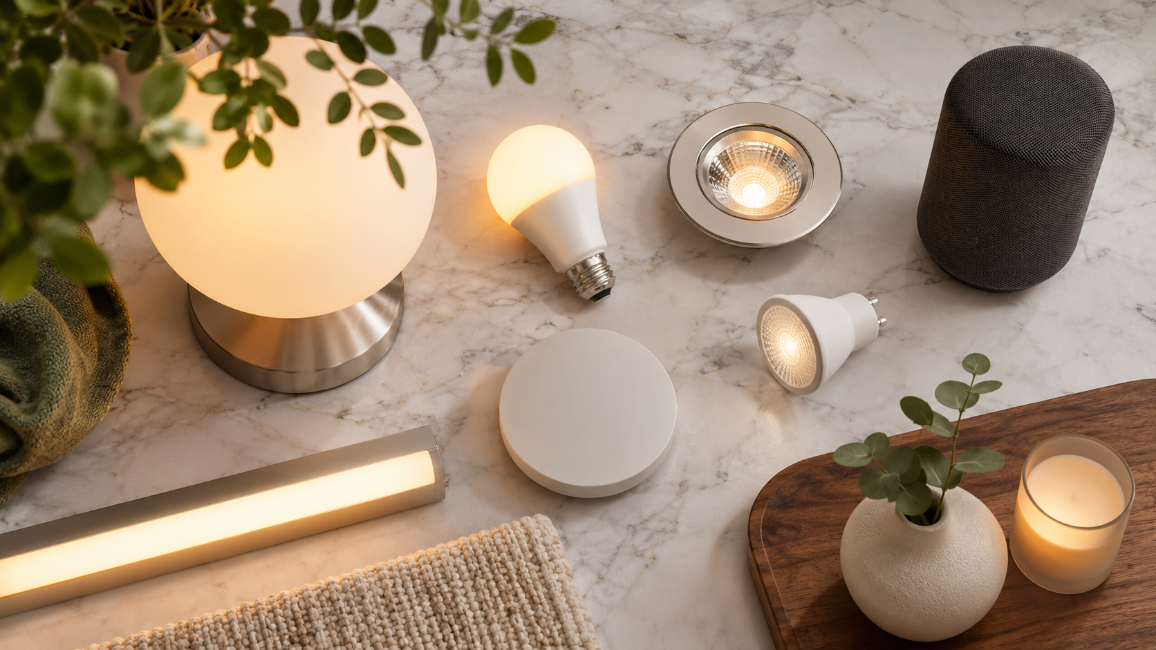
Two rooms can have the same paint, furniture, and artwork yet look noticeably different under different lights. A warm white lamp may make a cream wall feel welcoming, while another light of a similar apparent color makes it look dull or slightly green. The difference may come partly from color rendering: how faithfully a light source reveals the colors of objects.
That is why people choosing lighting for a renovated room, a minimalist desk setup, or a smart bedroom often ask: why does high CRI matter for home decor? CRI, or Color Rendering Index, is one useful way to compare how a light source renders colors against a reference. It can help you make informed choices, but it is not a complete measure of lighting quality. Brightness, color temperature, distribution, dimming performance, and personal preference matter too.
What CRI means
The Color Rendering Index (CRI) is a measure of how a light source renders a set of test colors compared with a reference source of a similar color temperature. The familiar general CRI value, written as Ra, is reported on a scale that tops out at 100. A value closer to 100 generally indicates that the tested colors look more like they do under the reference illuminant.
CRI is not the same as color temperature. Color temperature describes whether light appears warm, neutral, or cool, usually in kelvins. CRI describes color rendering. Two bulbs can both be warm white but render a red cushion or a piece of wood differently. Similarly, a high-CRI bulb can produce warm or cool-looking light depending on its color-temperature setting.
CRI also does not guarantee that every color will look perfect. The general Ra value averages results for a set of test colors, and can conceal weaker performance for particular saturated colors. Other methods, including the Illuminating Engineering Society’s TM-30 system, evaluate color fidelity and gamut with a broader set of samples. When detailed color decisions matter, look for fuller test information rather than relying on one headline number.
Why high CRI matters for home decor

Decor is a collection of colors and materials that interact with light. High color rendering can make those choices easier to see as intended: the undertones of paint, the variation in timber, the texture of a woven rug, or the colors in a print. This can be useful when comparing samples, arranging art, or choosing clothes in a bedroom mirror.
Consider a living room with a muted green wall, oak furniture, and rust-colored cushions. Under a source that renders some reds or greens poorly, the cushions may appear less vivid and the wall may seem flatter. A better-rendering source can reveal more of the differences among these colors. That does not mean the room will automatically look more attractive; it means the light is less likely to obscure distinctions in the objects and finishes.
For home decor, useful applications include:
- Paint and finish selection: Compare samples under the lighting you will actually use. Better rendering can help reveal undertones, though daylight and neighboring colors still affect perception.
- Art and decorative objects: More faithful color rendering can make pigments and material details easier to distinguish.
- Food and kitchens: Ingredients and cooked food can look more natural, which can make meal preparation and presentation more comfortable.
- Wardrobes and dressing areas: Clothing colors may be easier to judge, especially when the lighting is consistent with the place where the clothes will be worn.
- Furniture and textiles: Wood grain, leather, upholstery, and fabric colors can appear more differentiated.
These are visual benefits, not guarantees. The same object may look different in daylight, under another lamp, or beside a strongly colored wall. If you are making a costly paint or furniture decision, test samples in the room at different times instead of treating CRI as a substitute for seeing the materials in place.
CRI in a smart lighting system
Smart lighting adds control over brightness, schedules, and sometimes color temperature or colored light. Those controls can help shape an atmosphere for reading, entertaining, or winding down. But app features do not inherently improve color rendering. A bulb can offer extensive scenes and still render some colors less well than another source.
When comparing smart lamps, strips, or ceiling lights, check whether the manufacturer publishes a CRI or Ra value for the specific product and operating mode. Tunable-white products may perform differently across their color-temperature range. If the value is listed only for one setting, do not assume it applies equally to every scene. For color-critical spaces, look for product documentation that explains the measurement conditions, and test the chosen light in the intended fixture when practical.
For a layered setup, consider the whole room rather than just the bulb. A well-rendering lamp aimed at a glossy surface can still create glare, while a high-quality overhead source may leave a desk or countertop in shadow. Combine ambient lighting with task and accent lighting, and aim each source to suit its purpose. Dimming can support different moods, but check that the lamp and dimmer are compatible and that low settings do not flicker or change color in an unwelcome way.
Bluetooth SIG’s article, “Creating Healthier Spaces with Bluetooth Networked Lighting Control”, discusses networked lighting control and how connected systems can support adjustments to lighting in spaces. It is useful context for the control side of smart lighting, not evidence that connectivity itself raises CRI or that a particular setting produces a health outcome. Color rendering and network control are separate product characteristics.
Signify’s Hospitality and Workspace Design Show article considers lighting as part of the design of commercial hospitality and workspace environments. Its relevance at home is the broader design principle: lighting should be considered alongside the activity, surfaces, and atmosphere of a space. Commercial design examples do not establish that one lighting specification is right for every home.
For spatially arranged smart lighting, Stuff’s report, “Philips Hue SpatialAware treats smart lights like Dolby Atmos treats speakers”, describes a Philips Hue feature that considers the position of lights when arranging effects. Spatial placement can influence how a scene feels, but it answers a different question from CRI. A carefully coordinated color effect may be visually striking without being a neutral or faithful rendering of decor colors.
Practical steps for choosing lights
1. Start with the task and the materials
List what happens in the room: reading, cooking, video calls, dressing, relaxing, or displaying art. Note the finishes and colors that matter. A kitchen worktop, a desk used for detailed tasks, and a living-room accent wall may need different combinations of brightness, beam direction, and color rendering.
2. Compare CRI in context
Use the published Ra value as a screening measure, not a promise. A higher value is generally useful when faithful color appearance matters, but the label does not tell you everything about saturated colors, spectrum, glare, or consistency. Compare product documentation where available, and be cautious about comparing numbers that may have been measured or reported differently.
3. Choose color temperature separately
Decide whether the room should look warm, neutral, or cool for its main activities. Then assess color rendering at that setting. Warm light may suit a relaxed evening environment; a more neutral setting may be preferred for some detailed tasks. Neither preference changes what CRI measures.
4. Use multiple light sources
Plan ambient, task, and accent lighting where appropriate. A desk lamp can illuminate work without requiring harsh overhead brightness; a kitchen task light can reduce shadows on a counter; an adjustable lamp can highlight a shelf or artwork. Check that the added fixture does not produce distracting reflections on screens or glossy surfaces.
5. Try samples and scenes before committing
If possible, test the light in the room with representative paint, fabric, or furniture samples. View them in daytime and after dark. For smart bulbs, check several settings you expect to use, including dimmed levels. A scene that looks appealing on a phone may render a painted wall or fabric differently in person.
6. Verify compatibility and installation requirements
Before buying smart lamps, confirm their fit, base type, dimmer compatibility, wireless requirements, and whether they work with the controls you already use. For integrated fixtures, wiring changes, or unfamiliar electrical work, use a qualified professional. Do not assume that every smart bulb can be used with every dimmer or enclosed fixture.
Pros and cons of prioritizing high CRI
Potential advantages
- Colors and material details may appear closer to how they look under the relevant reference light.
- It can make comparing paint, textiles, artwork, and finishes easier.
- It gives shoppers another specification to consider for rooms where color appearance matters.
Limitations and tradeoffs
- CRI is an average and may not describe rendering of every color, especially saturated shades.
- A high number does not ensure suitable brightness, low glare, good dimming, or a pleasing color temperature.
- Products may not publish comparable information, and performance can vary by setting or product mode.
- Perception also depends on daylight, surrounding colors, surface finish, eyesight, and personal preference.
- Some people prefer a deliberately stylized look, in which case strict color fidelity may not be their priority.
There is no need to make every light in a home a color-critical source. A decorative lamp chosen for its shape or a smart scene designed for entertainment may serve a different purpose from a desk or kitchen task light. Match the specification to the room and activity, and consider total cost, energy use, replaceability, and fixture compatibility alongside rendering.
How CRI fits with other smart-home choices
Lighting is only one part of a comfortable, functional home. Smart thermostats can help manage heating schedules, but CRI says nothing about temperature control or energy savings. Smart-home security systems can coordinate sensors and lights, but a bright or high-CRI bulb does not make a security system reliable. Robot vacuums, air purifiers, and kitchen appliances have their own performance and maintenance requirements.
In a minimalist desk setup, combine suitable task lighting with screen placement and glare control. In a smart bedroom, adjustable brightness and schedules may help create a preferred evening environment, while color rendering remains a separate consideration. For eco-luxury or sustainable goods, review repairability, material sourcing, energy consumption, and product lifespan rather than using CRI as a proxy for sustainability. Lighting quality is one practical specification among many, not a general measure of a home’s safety, wellness, or environmental impact.
Questions and answers
Is a higher CRI always better?
Not for every use. A higher general CRI usually suggests more faithful rendering of the test colors, which can be valuable for decor and detailed tasks. It does not ensure that the light is bright enough, comfortable, efficient, or pleasing to you.
Does CRI tell me whether a bulb is warm or cool?
No. Color temperature describes the apparent warmth or coolness of the light. CRI describes how a light source renders colors compared with a reference. Check both specifications independently.
Should I use high-CRI lighting for artwork?
It can be useful, but also consider the artwork’s materials, the light’s spectrum and placement, glare, and conservation needs. Some artwork can be damaged by exposure to light, so follow appropriate conservation guidance for valuable or light-sensitive pieces.
Can a smart bulb have high CRI?
Yes. Smart control and color rendering are separate attributes. Check the manufacturer’s specifications for the exact bulb and, for tunable products, the modes you plan to use.
Does high CRI make a room healthier?
CRI is a color-rendering metric, not a medical or wellness rating. Lighting can affect visual comfort and how people experience a room, but health claims require evidence beyond a CRI value.
Bottom line
High CRI matters for home decor because it can help lighting reveal paint, furniture, fabrics, food, and artwork with more faithful color. It is most useful when appearance and color matching matter, and less decisive when the main goal is a dramatic effect or simple ambient glow. Treat Ra as one comparison point, check the light at the color temperature and dimming level you will use, and test it with the actual materials in your home.
Disclaimer: This article is general informational guidance, not electrical, medical, security, or financial advice. Follow product instructions and local electrical requirements; consult a qualified professional for installation or safety concerns.